The Social Dashboard
An application designed to harness the social conversation around the 2012 Election.
OVERVIEW
Create a web application covering the presidential debates and election night incorporating the political discourse happening on Twitter. The product also needed to share tweets with the live network broadcast.
PROJECT DURATION
We began production in late August and launched in time for the first presidential debate on October 3rd, 2012. This included integration with the live broadcast. Ongoing updates occurred for each debate.
MY RESPONSIBILITIES
I was part of the consulting team including the VP of Digital, lead product manager and head of engineering. I assisted in the product scope, technology exploration and responsible for the products UI/UX and visual design.
The Challenge
HARNESS THE SOCIAL ELECTION CONVERSATION
The president of Current TV approached us with a challenge to build something unique using the massive political conversation happening on Twitter. Three primary objectives were identified…

Integrate Twitter
Twitter was exploding with relevant and meaningful debate around the coverage. The trick was to tap into the pipeline, curate, then find a unique publishing solution.
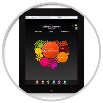
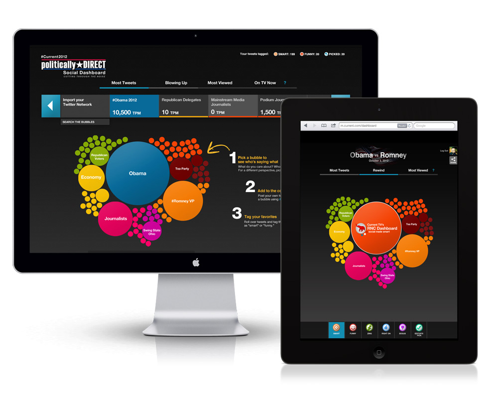
Work on iPad
Our president loved his iPad. We also knew that this product could potentially be a great two-screen experience, so we decided to challenge ourselves and get it working on tablets.
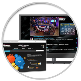
Share on TV
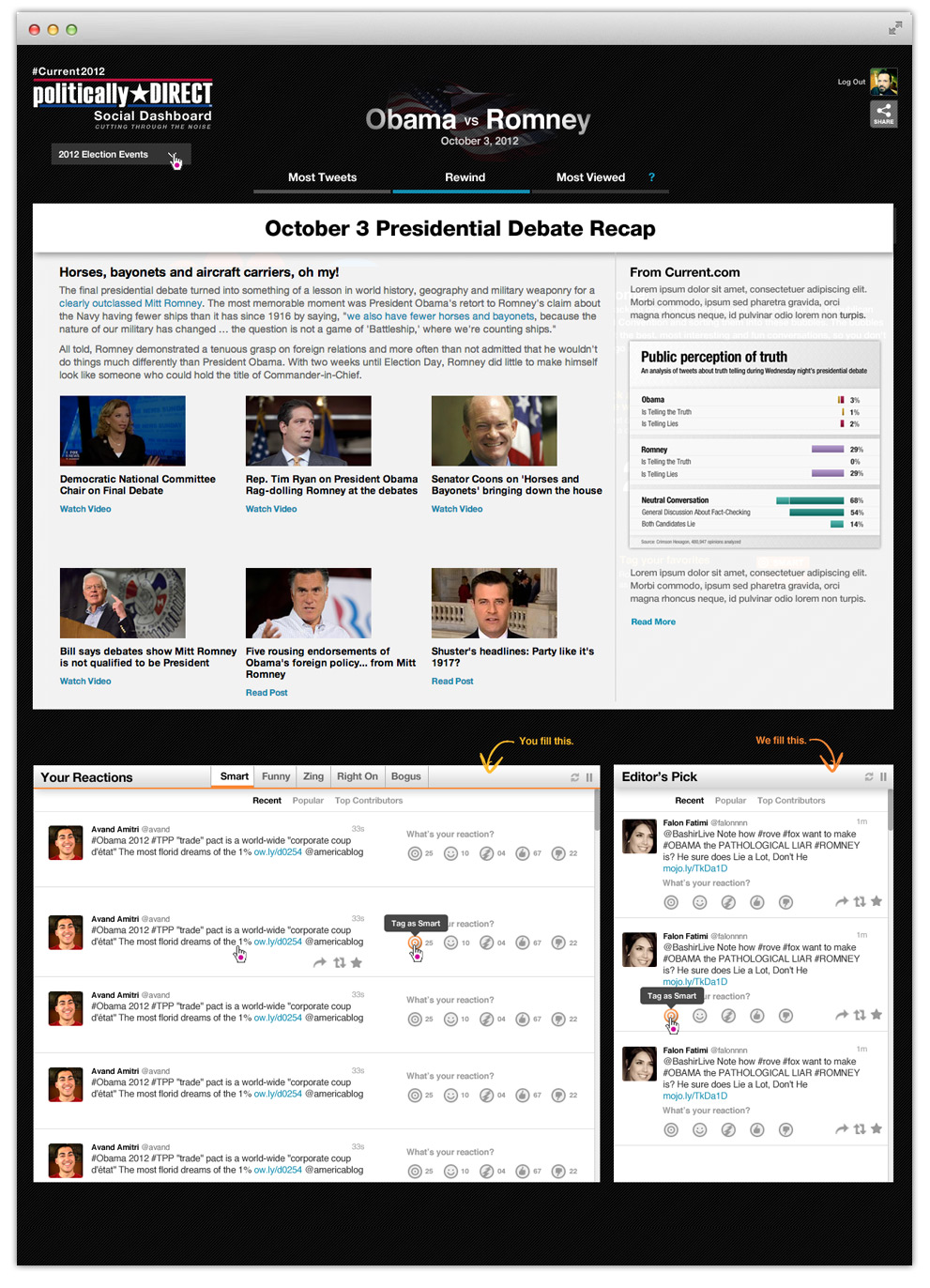
This was the biggest task of all. We had to develop a system that would display the topics of conversations in real-time and on-air as well as be talking points for the correspondents.
The Vision
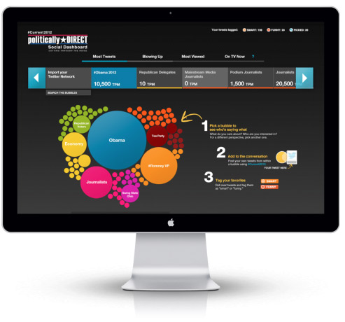
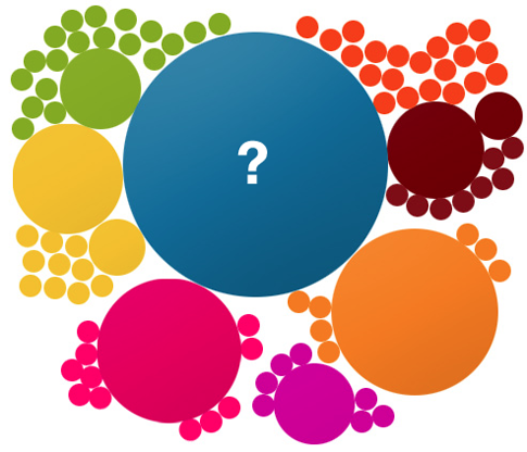
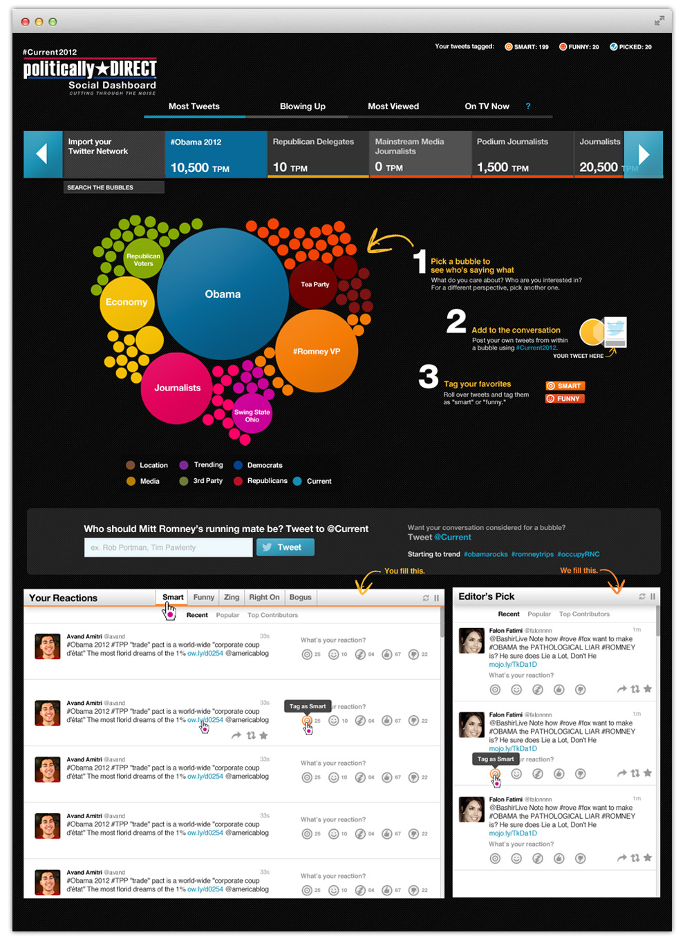
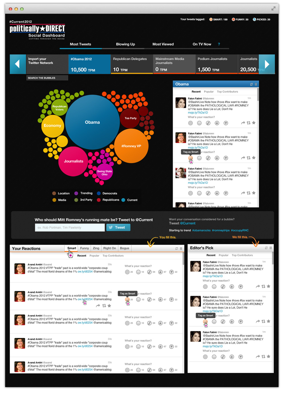
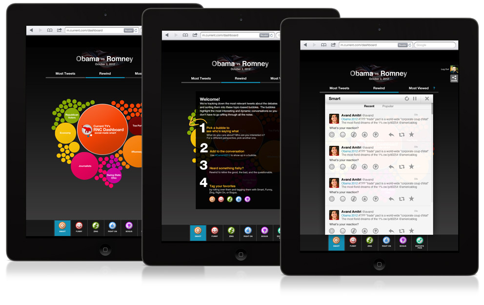
Bubbles of conversation
Our president had a vision, he wanted to see the conversations happening within bubbles. Literally. Visually, he saw these bubbles expanding and contracting as the conversations increased in volume, constantly changing, creating a user experience that was immediate and arresting. He had seen an application elsewhere use a bubble motif in a similar manner and thought the Dashboard was a great project to put his vision into action.
To a designer with a strong focus on the user experience, this presented a fantastic challenge. Not only was this going to be a technology hurdle, but designing an interface that a user could easily understand and engage as well as scale was not going to be easy.
The Technology
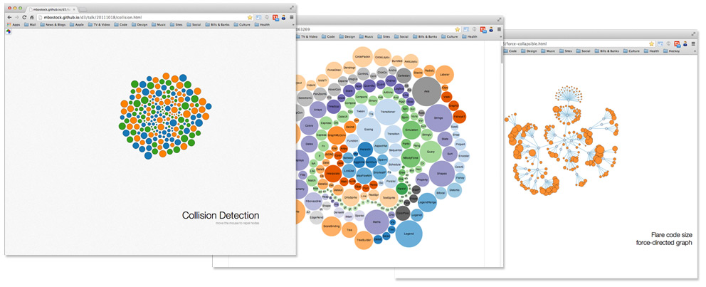
UNDER THE HOOD
During the research phase we looked to D3.js, a JavaScript library that manipulates documents based on data, using HTML, SVG and CSS. It seemed to be a perfect fit for the project. Dynamic, data driven visuals that responded to time-based, user-generated actions. These are a few examples of the ones we liked the best and worked to achieve our technology goals.
The Framework
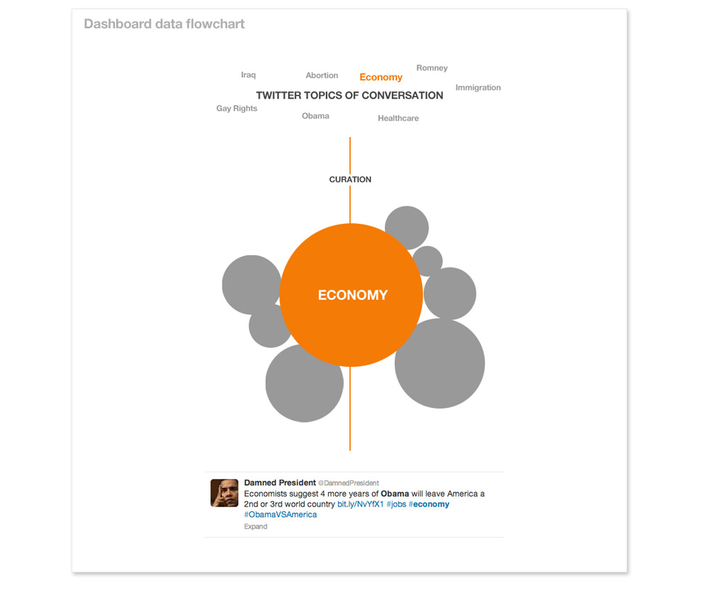
EARLY DATA FLOWCHART
This comp reflects the most simple end-to-end user flow. Conversations happening on Twitter are curated into topics, or bubbles. The user can then interact with the bubbles to drill down and view the conversations happening in real time.
The Early Designs
INITIAL DESIGN CONCEPTS
I began the project by first exploring the interface and how to handle the user flow. These comps show some early concepts. I realized early that because there were both passive and active viewing experiences available to the user, the app could become overwhelming. Another challenge was the navigation and filtering system which the product team thought would make the experience more engaging for the more passive user. Coupled with the requirement to allow users to add their own tweets and then push to the network broadcast, the product was becoming complicated both technically and visually.


Exploring the intro screen and how to navigate the app. Also showing a show/hide navigation tab to allow users to hide the topic navigation system.
Early exploration into interaction with a particular topic (bubble). The tweet display was not required throughout so the display window needed to be user-activated when clicking on a bubble.
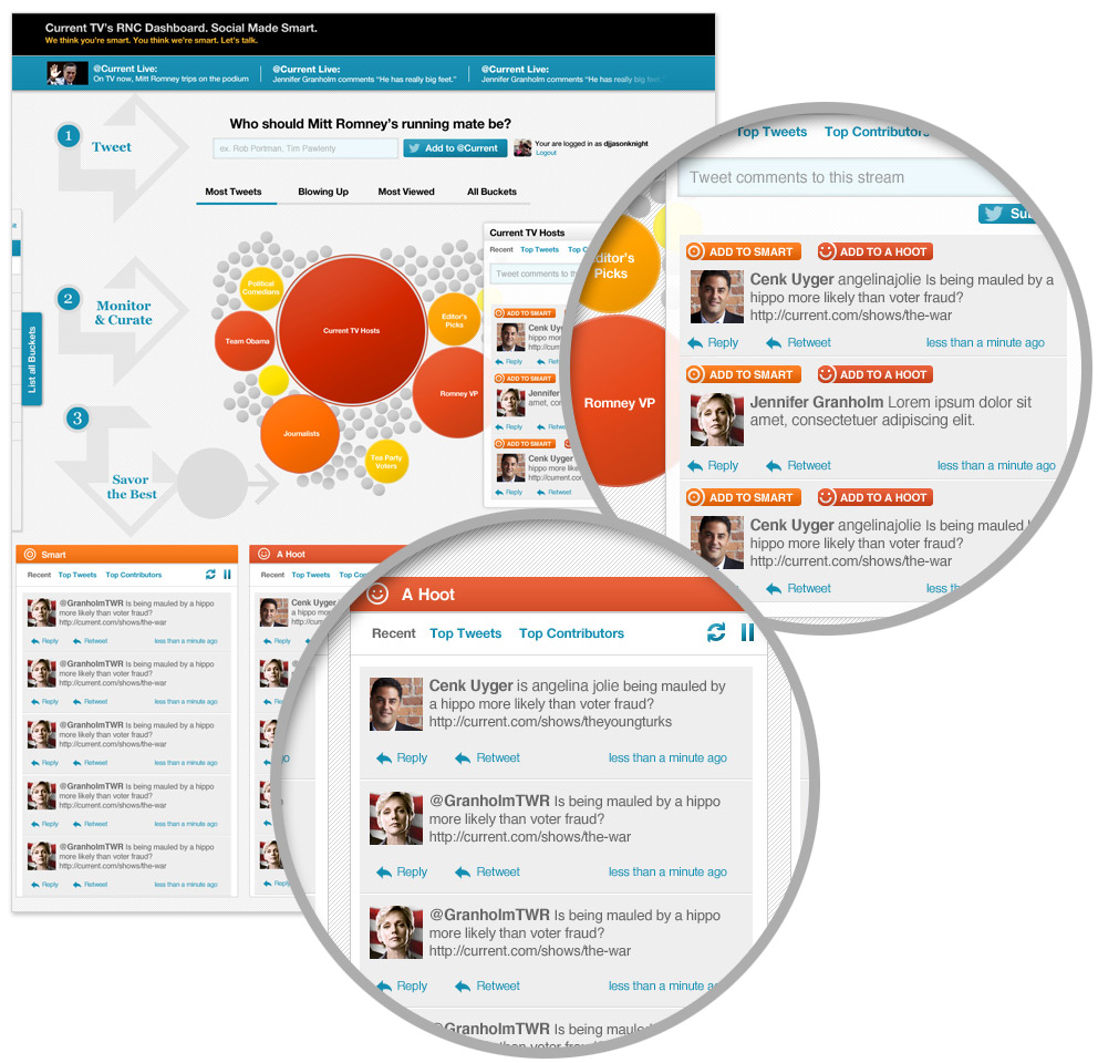
User curation features
The product team wanted to add more features to the application that would allow a user to do even more filtering and curation. This added a level of complication to the design as it now required a solution to allow users to choose their favorite Tweets and tag them to “Buckets”. In this comp you can see the Bubble content tweets with added tagging elements “Add to Smart” and “Add to Hoot”. When the user selected these, they were dynamically added to the buckets located below the main design.
The Final Designs
FEATURE FULL & GREAT LOOKS
In the final design I made a sweeping change to the look while continuing to focus on new features. I wanted the app to have a more cinematic aesthetic and give the users the feeling of sitting back and enjoying the experience. Inverting the design to a dark palette helped to achieve this. You can also see the added filter search bar at the top for easier searching of topics.
Watch the application in action
We created a promo video to submit to the Webby Awards. This trailer shows some of the Dashboards interaction as well as how we tied it to the Network broadcast.
The Results
56,000 PAGE VIEWS
Based on TrendrTV reports during the election season, The Social Dashboard came in 4th for most viewed pages coming in under CNN, MSNBC and Fox. Our time on site was reaching 4 minutes per visit, the highest coming on the election night. Still, we had several technical problems arise throughout the experience from our Twitter feeds provided by Crimson Hexagon, as well as QA issues due to the lack of solid testing data leading up to the debate nights. As a result, there was downtime and delay’s in producing accurate, real-time data within the bubbles.
User experience was also hampered by sluggish response to the bubble animations and tweet feed list, but by the night of the election we had worked out all the kinks and the app was working beautifully. All in all the project was one of the most challenging of my career and also one of the most interesting. Our small team, limited resource and incredibly short time-line managed to pull off a worthy and notable application that from user feedback, resulted in enhancing their two-screen experience watching the election.
What users said
“Current TV is taking second screen comments to the next level, by bringing them back to the first screen. This unique look could provide the template for future social interaction on TV.”
— Silicon Cloud
“Experiments like Current TV’s Social Dashboard encourage television viewers to engage with a presidential campaign through social media.”
— Yahoo Advertising
“Love the Social Dashboard on current.com… brilliant”
— Sarah Warfield, Twitter user