OVERVIEW
Create a political news destination site covering the 2012 election and promote to the broadcast coverage. The product also integrated the social conversation around the election.
PROJECT DURATION
The project took place between January to March 2012 with the product going live on the first of April, with ongoing updates throughout the election period leading up to November 4th.
MY RESPONSIBILITIES
I took part in the initial product meetings and was responsible for the experience strategy, product and visual design. I also played a role in the development cycles as needed.
The Challenge
Build a Competitive
Political News Destination Site
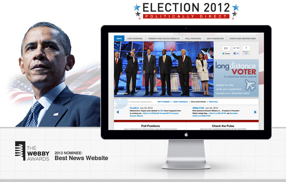
The digital team was asked to create a leading destination site to cover the 2012 election. The topic was enormous and the competition fierce. Our team did a deep dive into what the other networks had offered in past elections and then considered new technologies available to help create a unique and compelling experience. We also wanted to harness the massive conversation happening on social sites and make that a touch point of the project.
The Technology
Finding the right technology
During our research phase we understood quickly that there were some third party data sites that were industry standards being used to pull in polling information and other election data. We also explored the many new social aggregate options available on the market to help paint a picture of not only the standard data but to try and tell a meaningful story of the conversation happening around it. Another big technical decision was to make a massive change to our internal back-end technology, moving from a custom-built publishing platform to Ruby. As a result, we came up with three partners to help us achieve these goals successfully.


The Framework
A modular concept designed to scale
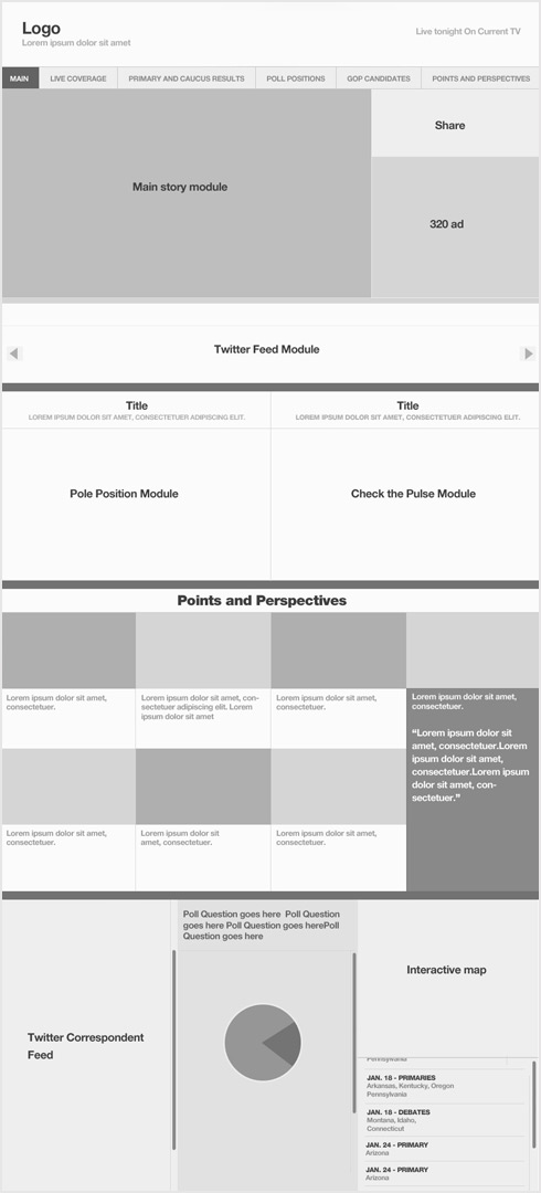
Once we had a better understanding of how to curate the data and how to present it, I began to wireframe. Because the data would constantly be changing based on daily factors such as polling, news coverage and events, it quickly became clear to the design team that we needed to modularize the site. It needed to have sections or modules that could easily be interchanged on the fly to represent the data.
Polling, trend data, editorial, maps, all needed to be available and easily implemented on the back-end. Because of the flexibility of Ruby and examples I was seeing being used, I considered a complete modular approach to the site. This wireframe shows all major modules at the time it was complete and ultimately the final design of the site flowed from this wireframe.
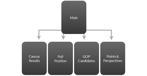
SITE TREE
The product team was also developing the site tree to build out the experience and make sense of the news, polls and editorial data that was pouring in.
The evolution of the design
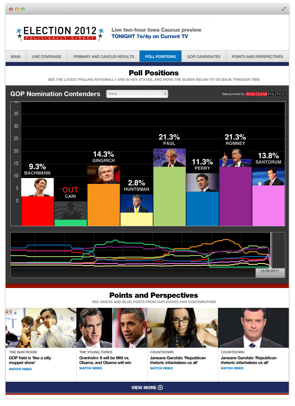
Visualizing the layout
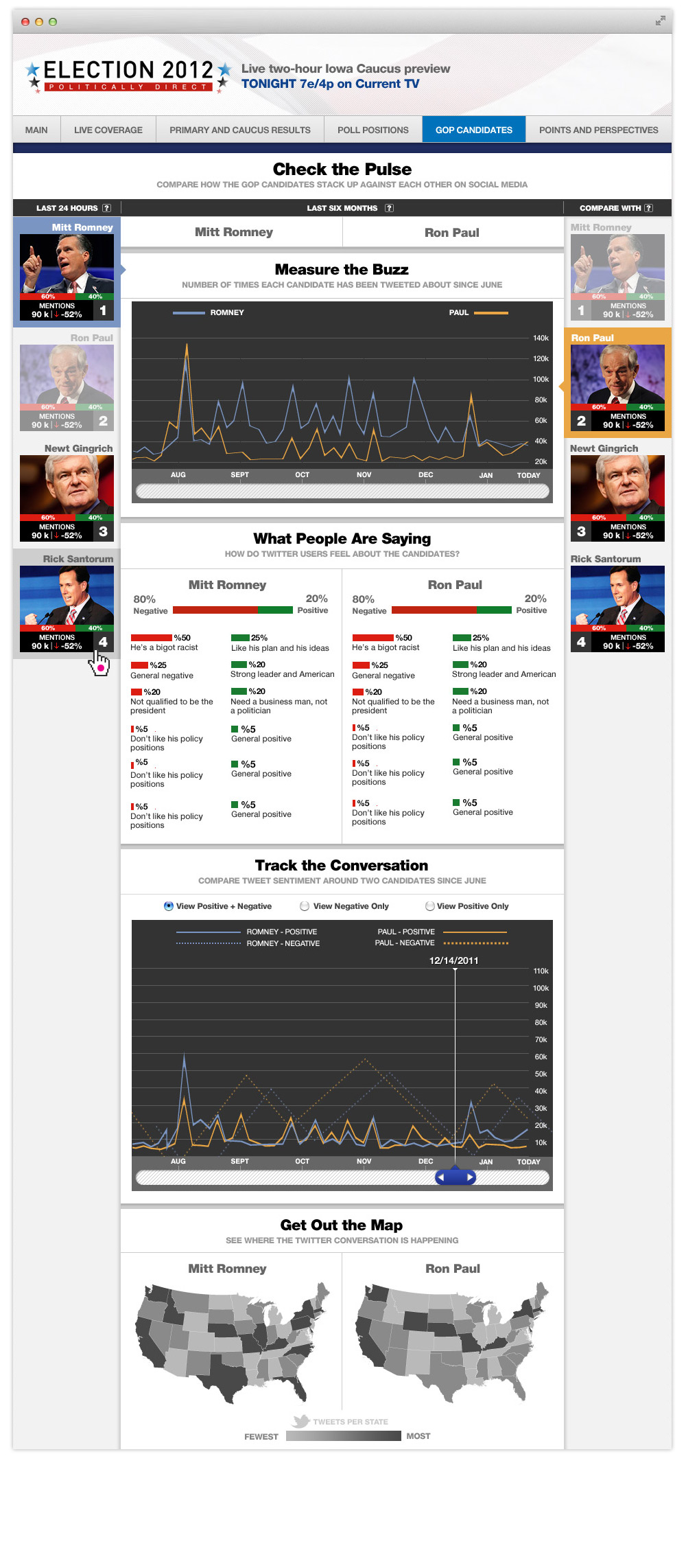
These next series of comps show the wireframe begin to take on the visual design. Each module came to life, helping to define the aesthetic that would flow through the entire experience. With so much data, I wanted to keep the visualizations clean, modern and most importantly easy to understand.
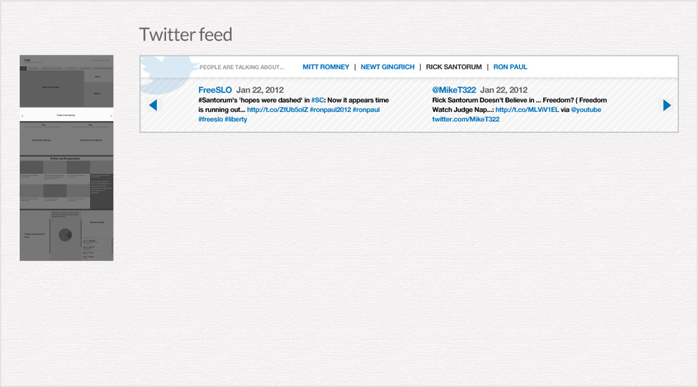
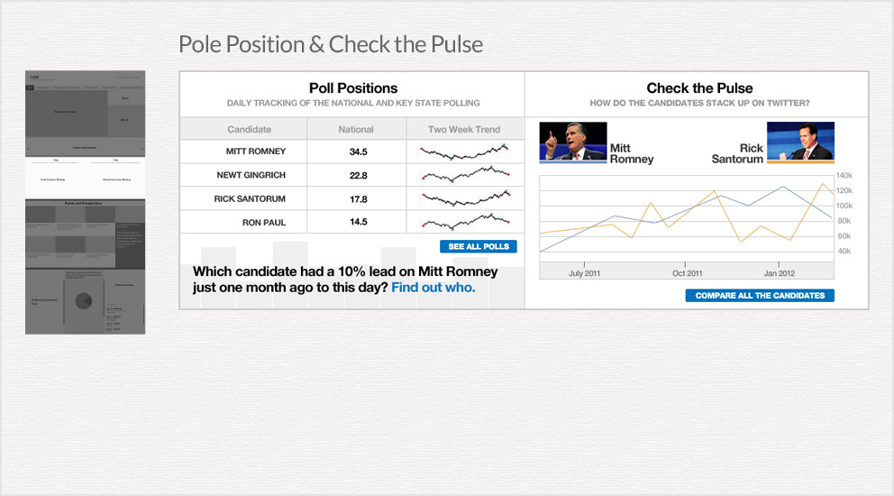
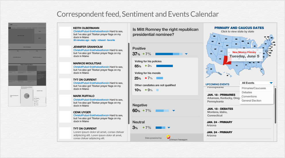
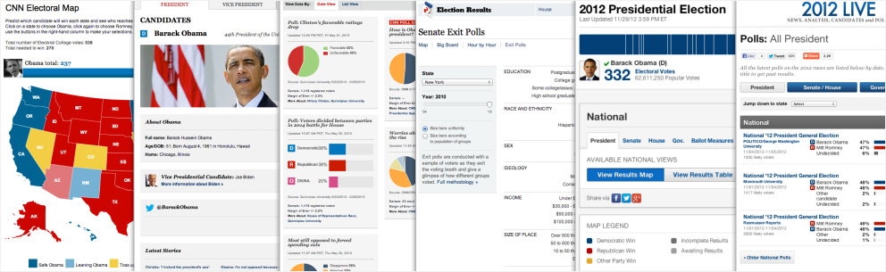
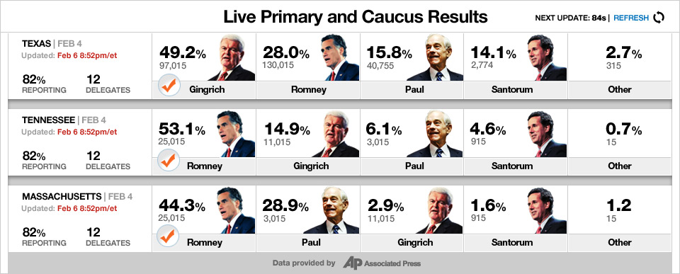
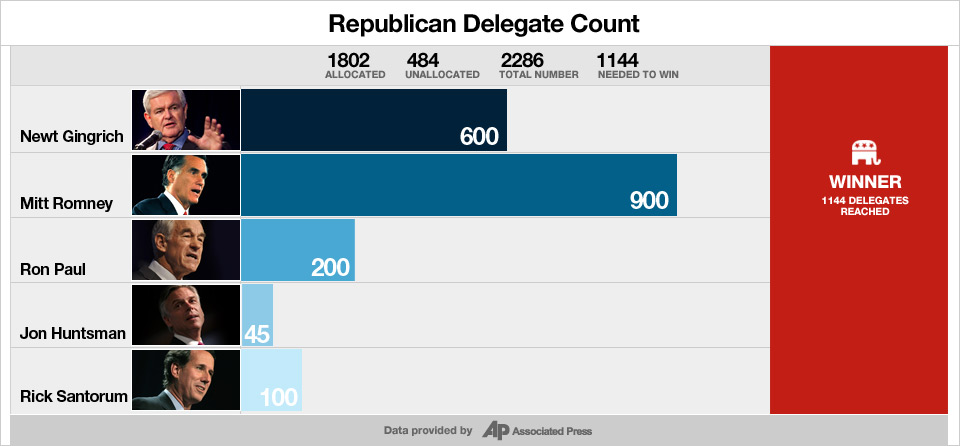
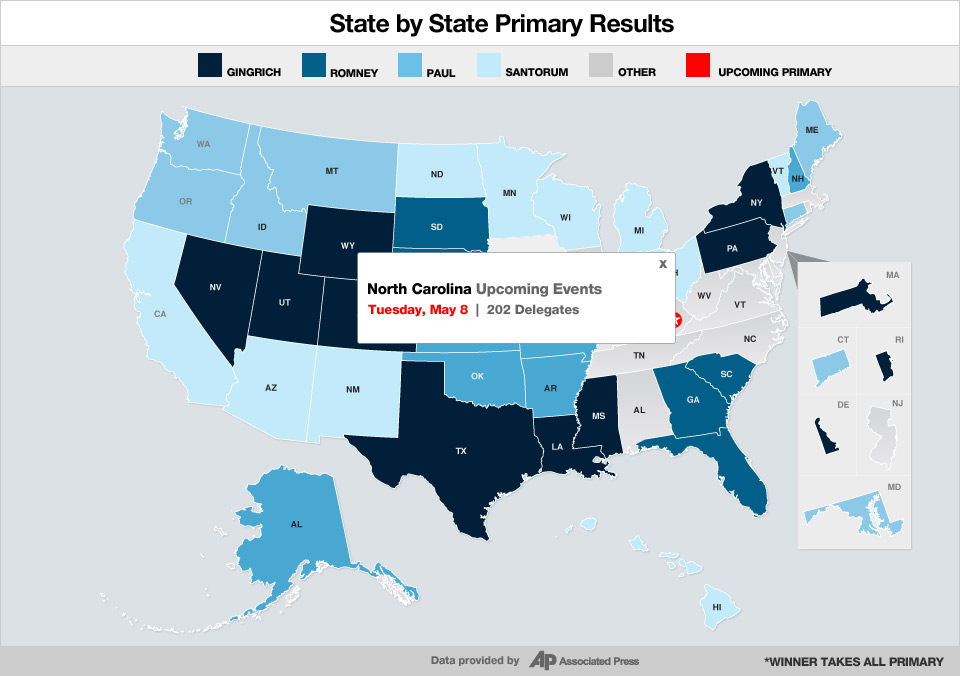
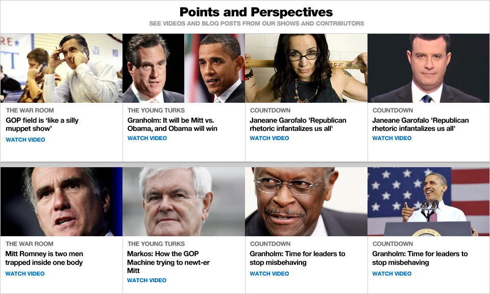
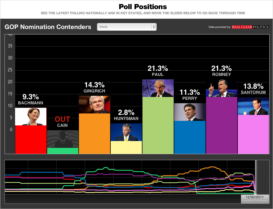
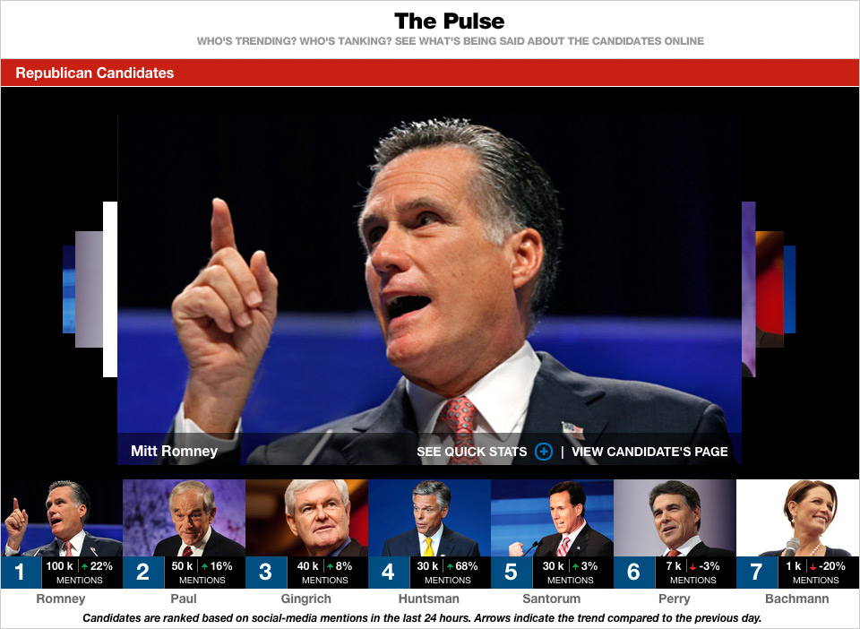
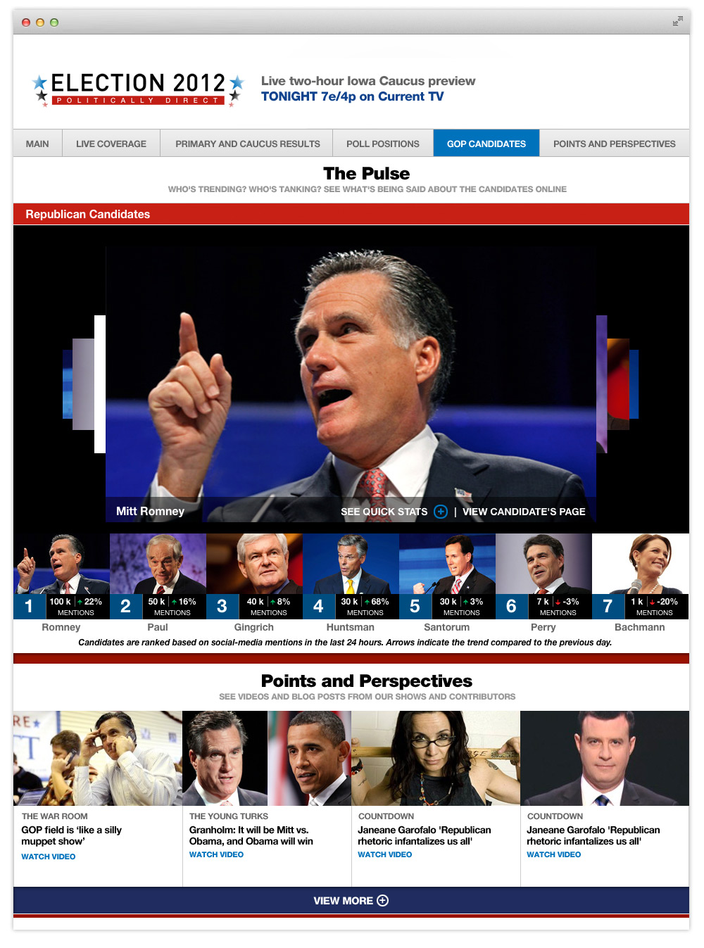
More data visualization modules
As we continued to build out the page, additional modules were required. Many of these made their way onto tertiary pages. These modules show polling, primary results, candidate tracking, social integration and future primary data being used.
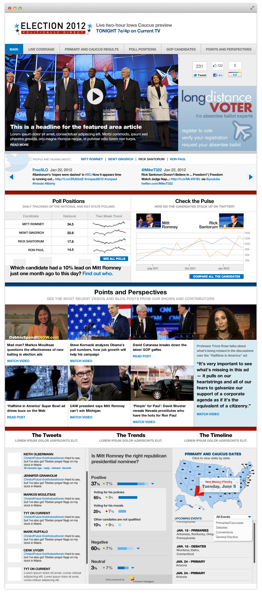
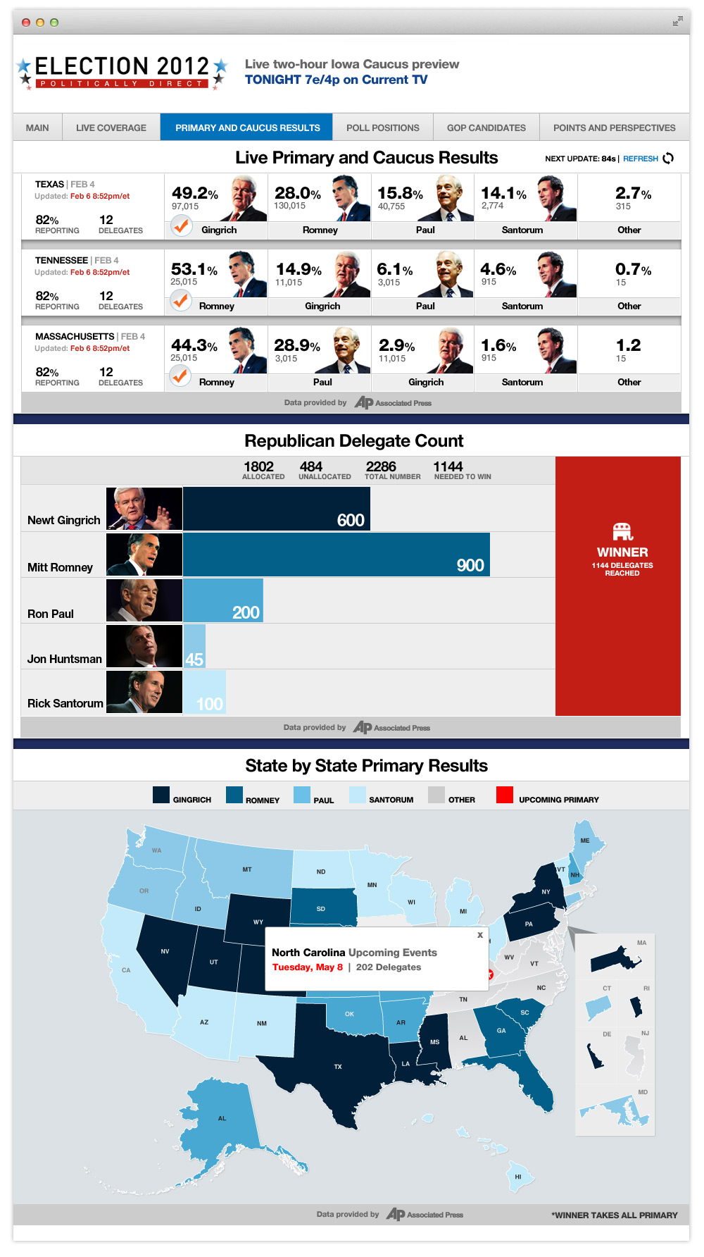
The final designs
Realizing the Concept
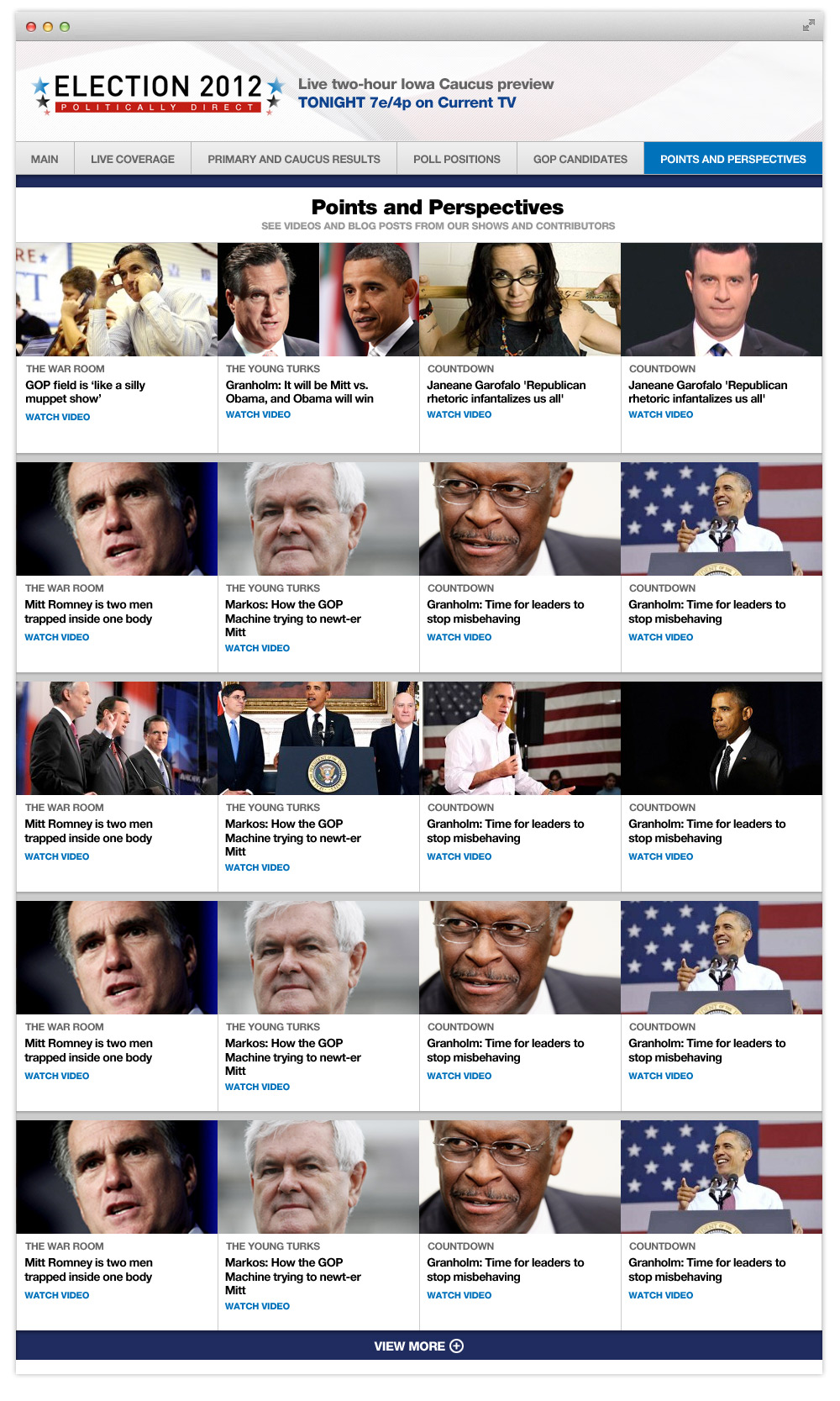
Here are the final comps of all the pages on the site. Many of the modules shown on some of these tertiary pages could easily be slotted onto the homepage when there was relevant data or editorial around a certain event or candidate. The Engineering department did an amazing job of creating a publishing platform that enabled the editing team to make the changes on the fly and with relative ease.
Click on the images to view full scale
Final comments
This project was a first for many of us in terms of it’s scope, scale, technology and evolution over time. Data was the hurdle but the real challenge was telling the story using the information. As each debate, caucus or spike in conversation around an event or candidate took shape, we found ourselves re-thinking the modules and tweaking them to suit the story that was ever-evolving. Our users appreciated the approach, especially the comparison data visualizations. There was a real gravitational pull to these pages and we saw it in the page views and time spent on these pages.
I feel the design was as functional as needed, but could have been more thought out from the beginning. I found myself confronted with problems from a UX standpoint that kept me from fully realizing the concept to design. We experienced page load problems at the beginning and countered this by creating additional sections to the site. The team felt this was not the most ideal solution, but overall the experience maintained integrity and told the story in a unique way, thus achieving one of the main goals of the product.