Design Scanner
An app idea to inspire and educate creative professionals.
Design Scanner scans the best design sites, articles and tutorials on the web, presenting the content in a beautiful and customizable interface, tailored to a users interests. The result is an experience that brings together inspirational design and informative articles, as well as a utility that finds and manages the enormous, but often overwhelming world of tutorials.
Two apps in one
As a designer I come across great articles, resources, tutorials and inspiration all day. Aggregator apps are something all of us rely on to help manage the massive amount of digital stimulus we allow into our lives. As designers it can be even more intense as we are constantly judging other work, searching for answers to questions and trying to stay on top of the ever-changing landscape
where technology and design are converging. I have my favorite blogs, sites and RSS feeds that provide me with this information, yet, after searching for months, I was unable to find an aggregator that pulled in topics of interest related to design and inspiration and also did a good job at corralling tutorials that come to be so useful for designers on a daily basis.
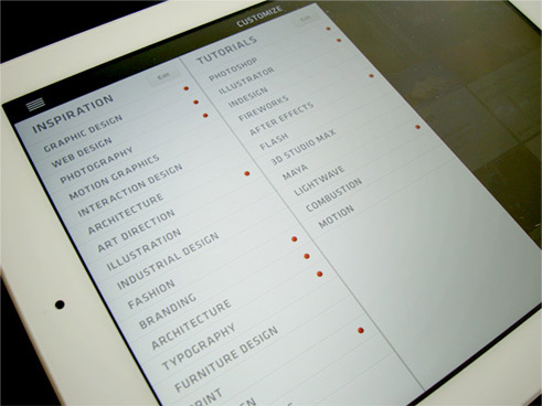
FOCUSING ON THE GOALS

Create an inspiring experience
Design a beautiful content aggregator that caters to the design community with the ability to select your topics of interest and have the app publish you relevant content.

Create an app for learning
Design a tool that aggregates resources and tutorials around topics or software. Want to find some nifty Illustrator tips and tricks? Want to learn more about that new tool in Photoshop? Searching for the perfect texture background? It’s all out there.
Why a tablet app?
As a sit back experience to check out articles and inspiration, Design Scanner for the tablet was right choice. I also tend to use a tablet when I’m working as a supplemental screen while designing for multiple platforms and as a means to reference additional content without having to click between apps on my desktop screen. I find it to be useful and increase my productivity.
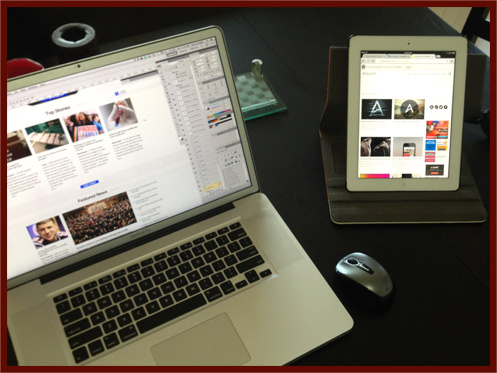
The building blocks
The grid layout is essential to great responsive design and clean content presentation. I chose this as my primary layout but managing both portrait and landscape layouts proved to be a challenge. I hadn’t taken into account the nav bar between both orientations and also consideration for different gutter space between tiles.
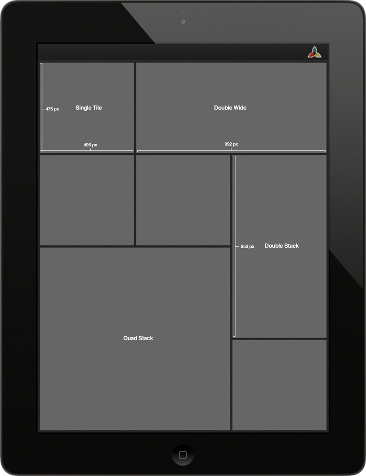
Customizing search and article results using stacked tiles in different sizes was also a requirement. I want the user to be able to define the view (in future revs) so I developed stackable tiles to suit both orientations. As a result, a user would be able to merge different tiles with one swipe.
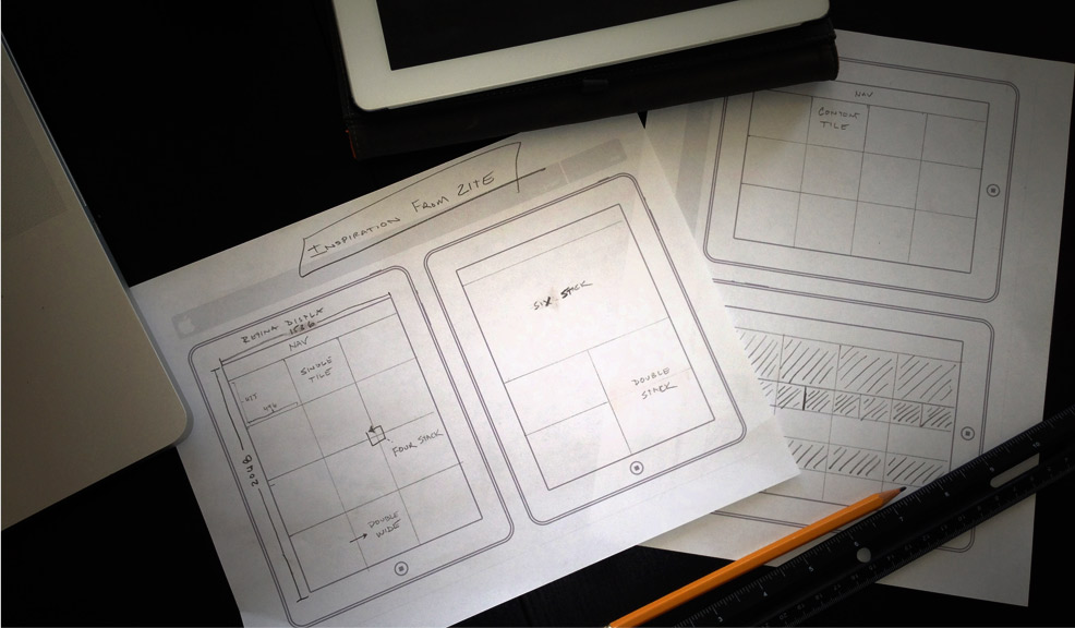
THE FINAL WIREFRAME
Single Tile, Double Wide, Double Stack and Quad Stack
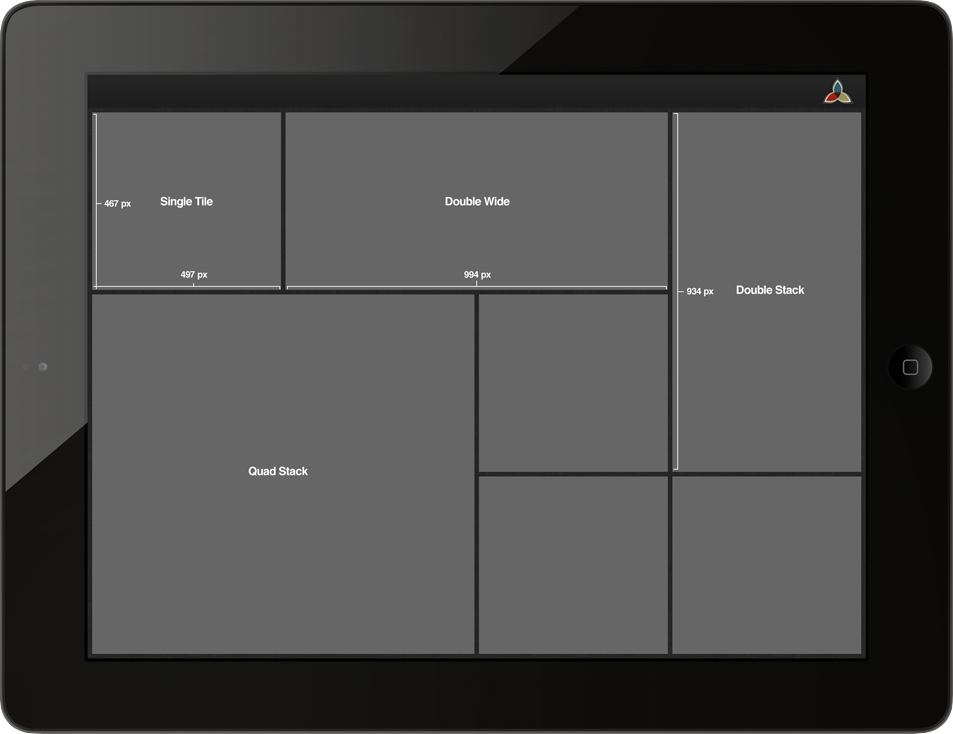
Designed for usability and customization
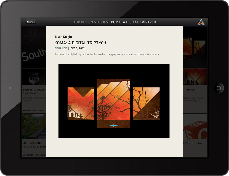
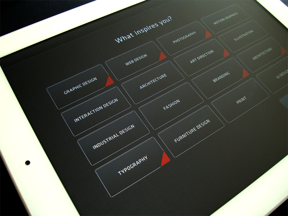
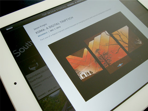
Here are views from the start page which allows a user to select favorite topics and tailor their content. The goal here was to make it as simple and easy to set up and begin consuming content. Also included are comps of the results page and an article detail page. With the app doing double duty, the design needed to be flexible to handle both needs.
TOPIC SELECTION SCREEN
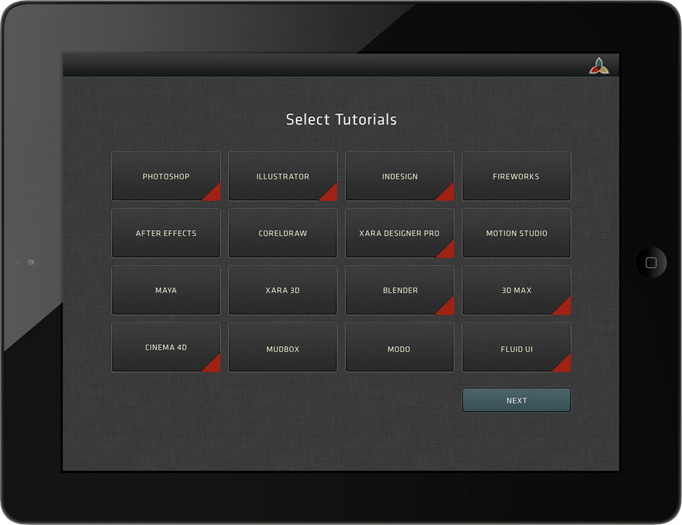
TUTORIAL SELECTION SCREEN

CUSTOMIZE TOPICS AND TUTORIALS SCREEN
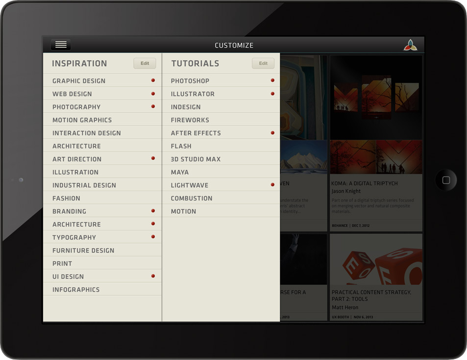
EDIT SCREEN
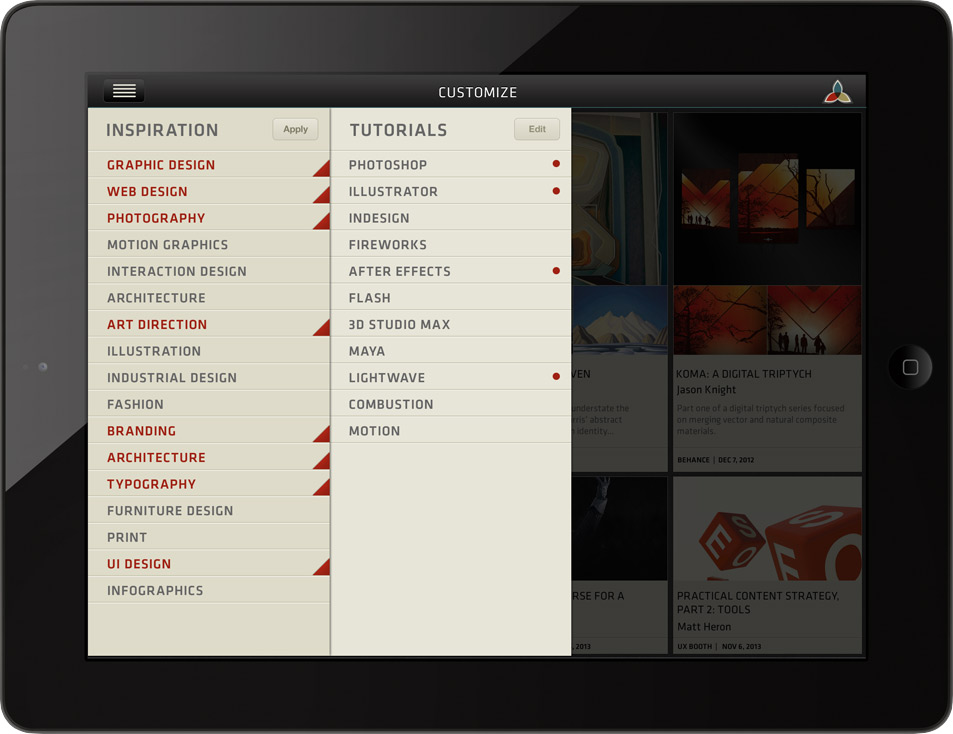
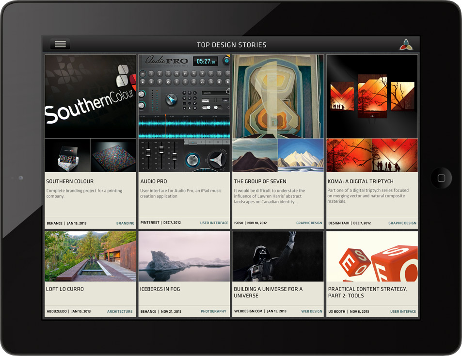
TOP STORIES SCREEN
STORY SCREEN
